

Published: September 15, 2026
By: Seth Edwards
An Illinois corn grower’s 74.7-acre field was flown with high-resolution drone imagery on July 16, 2026, while the crop was at roughly V12. Ten days later, on July 26, a thunderstorm carrying hail moved through the field on the hottest day of the season, with a high of 95°F paired with 0.49 inches of rain. AGMRI captured the field again on July 28, giving the grower and agronomy team a dated, apples-to-apples comparison of conditions immediately before and after the storm.
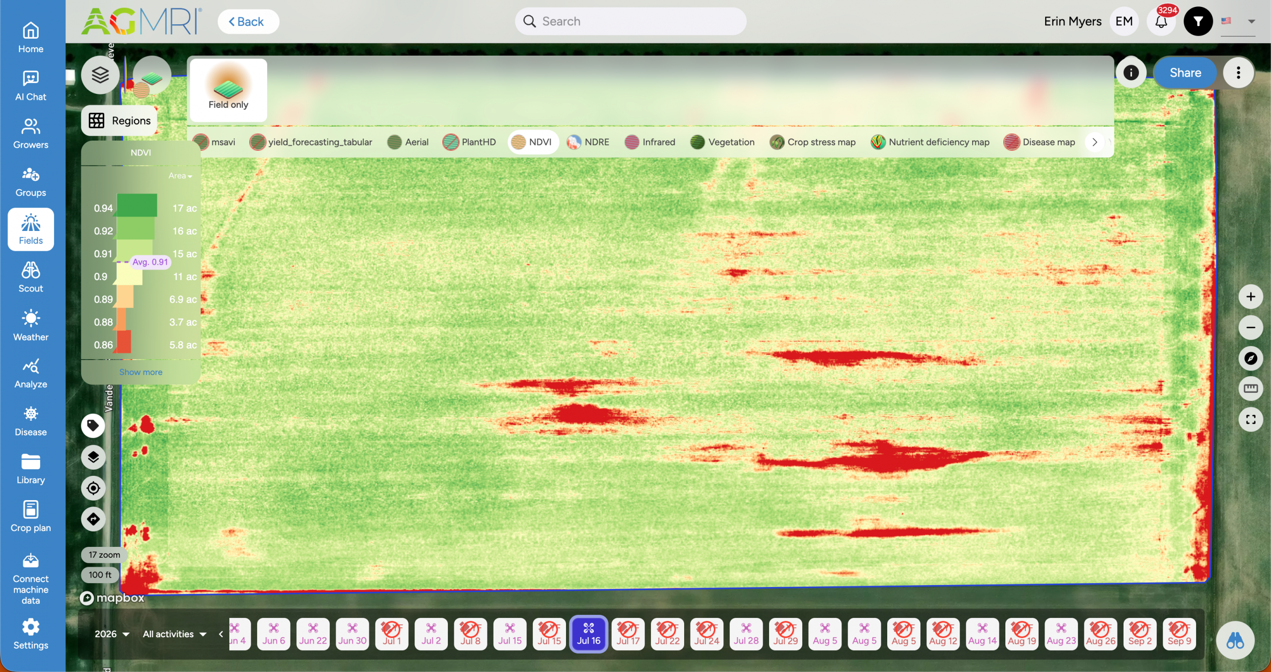
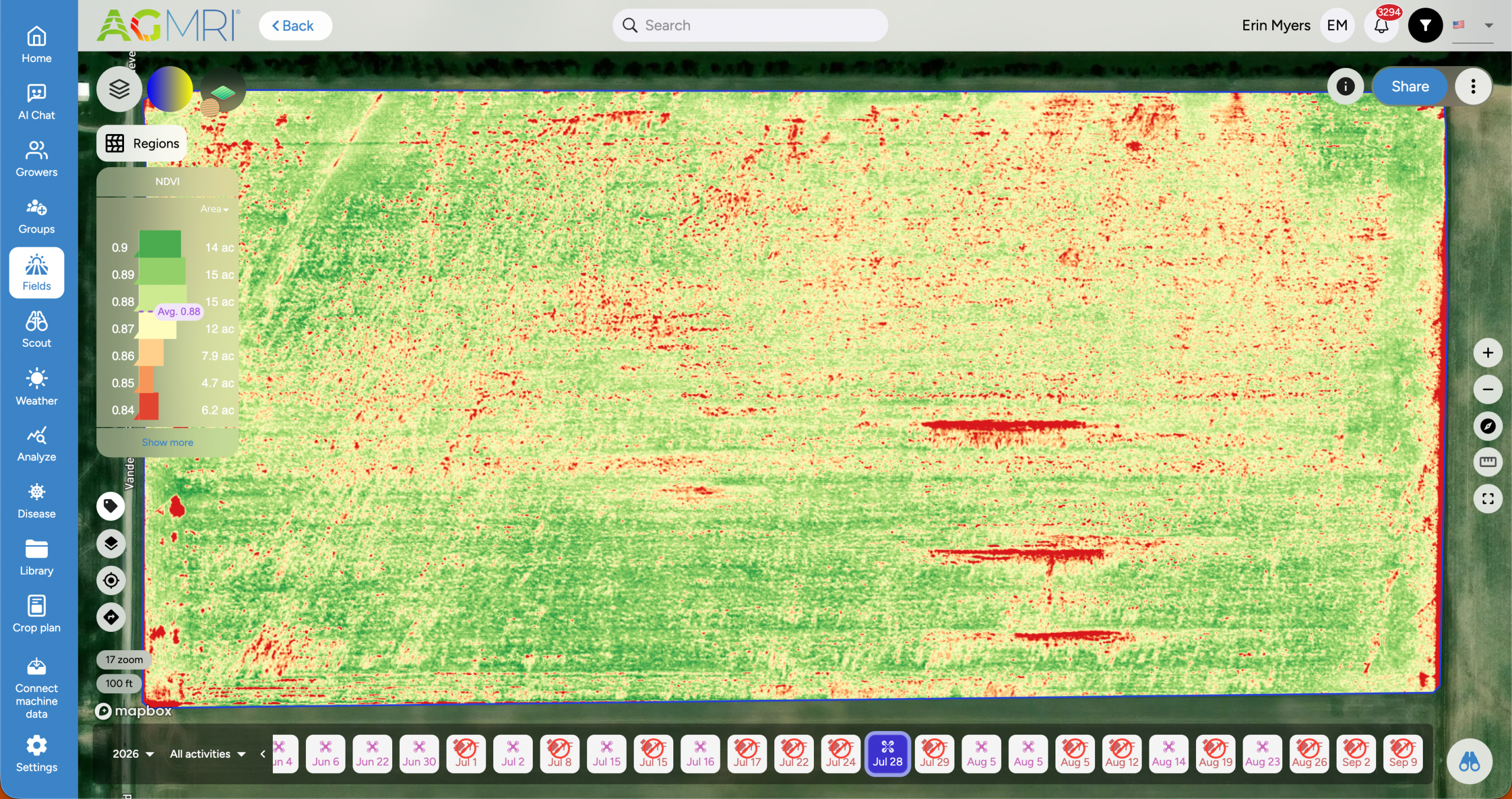
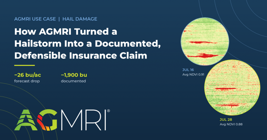
Side-by-side AGMRI NDVI maps of the same Illinois cornfield on July 16 and July 28, 2026, show crop stress spreading across the field after the July 26 hailstorm as the average NDVI fell from 0.91 to 0.88.
Why Ground Inspection Wasn’t Enough
A walk-through can confirm that damage happened. What it can’t easily do is quantify how much of the field was affected, whether the damage was severe enough to move the needle on yield, or where the worst zones were concentrated. Without that, the grower had limited ability to document the scale of the loss or prioritize which areas needed ground-truthing first, both of which matter for harvest planning and for an insurance claim.
What the Imagery Showed
The two flights, paired with the field-level weather record, gave AGMRI everything it needed to isolate the July 26 event and measure its effect:
- NDVI (field average): 0.91 → 0.88, a 3.3% decline
- Model yield forecast (field average): 193 → 167 bu/ac, a 26 bu/ac (13.5%) decline
- Acres forecast at 190+ bu/ac: 51.7 → 0.7 acres
- Acres forecast at 150 bu/ac or lower: 3.0 → 36.0 acres
- Stressed acres: 5.8 → 18.8 acres, up 224%
Across the full 74.7-acre field, that 26 bu/ac drop works out to roughly 1,900 forecast bushels and, at $4–$5 corn, an estimated $7,600–$9,500 in economic exposure.
Just as important as the numbers was the pattern: the decline in NDVI and the decline in yield forecast showed up in the same row-aligned streaks across the field. That agreement between two independent measurements—plant health and yield potential—gave the team confidence the imagery was capturing a real, storm-driven effect rather than noise.
From Data to Decisions
The before-and-after maps did two jobs at once. First, they gave the grower dated, objective documentation paired with the field weather record confirming the July 26 storm to support a crop-insurance conversation. Second, they turned scouting from a blind search into a targeted one: instead of walking the entire 74.7 acres, the team could go straight to the zones where NDVI and yield forecast had dropped the most and check whether those plants were lodged and recoverable or permanently damaged.
It’s worth noting what this data does and doesn’t tell you. These are model yield forecasts, not measured harvest yield, so the real financial impact still needs validation against combine data at harvest. The imagery provides an early, objective read on where and how severely the crop was hurt, while there’s still time to act.
The Takeaway
One weather event, one before-and-after flight pair: a 26 bu/ac forecast decline, roughly 1,900 bushels documented, and a clear map of where to look next. That’s the kind of evidence that turns “the field got hit pretty hard” into a number a grower, an agronomist, and an insurance adjuster can all work from.
Frequently Asked Questions
What happened to this field?
On July 26, 2026, a thunderstorm carrying hail moved through a 74.7-acre Illinois cornfield while the crop was at roughly V12. It was the hottest day of the reviewed weather window — a high of 95°F with 0.49 inches of recorded rain — bracketed by dry, calm days, which pinned the damage to a single event.
How did AGMRI measure the hail damage?
AGMRI compared two high-resolution drone flights: a pre-storm capture on July 16 and a post-storm capture on July 28. The comparison evaluated field-average NDVI, acres in stressed NDVI classifications, the model yield forecast, acreage across yield-forecast tiers, and the field-level weather record surrounding the storm.
How much yield did the storm take off the forecast?
The model yield forecast fell 26 bu/ac, from 193 to 167 — roughly 1,900 forecast bushels across the field. Acreage forecast at 190+ bu/ac collapsed from 51.7 acres to just 0.7, while acreage at 150 bu/ac or lower grew from 3.0 to 36.0 acres. At $4–$5 corn, that’s an estimated $7,600–$9,500 in economic exposure.
Can this kind of data support a crop-insurance claim?
Dated pre- and post-storm imagery, paired with the field weather record confirming the July 26 event, gives a grower objective supporting evidence for the insurance conversation. It documents when the damage occurred, how much of the field was affected, and how severely — the questions a claim has to answer. Final loss determinations still follow the insurer’s adjustment process.
Are these numbers actual harvest yield?
No — the reported values are model yield forecasts, not measured harvest yield, so final impact should be validated with combine data at harvest. What the imagery provides is an early, objective read on where and how severely the crop was hurt, while there’s still time to act on it.
How did the maps change scouting?
NDVI and yield forecast declined in the same row-aligned streaks across the field — two independent measurements agreeing on where the damage was concentrated. Instead of walking all 74.7 acres, scouts went straight to the hardest-hit zones to determine whether plants were lodged and potentially recoverable, or permanently damaged.
Seth Edwards is a Territory Account Manager for Intelinair.