

Key Takeaways
- The 2026 harvest season is officially underway. Intelinair’s County-Level Yield Forecast publishes a new round every two weeks, folding in the latest satellite, weather, and soil-moisture signals.
- Comparing consecutive rounds shows a team not just where the crop stands, but how much, and how fast, the read is moving as the season plays out.
- Each round is checked against USDA’s weekly crop condition survey, an independent signal used to confirm the model’s read or flag where a closer local look is warranted.
- When the model’s forecast and the public condition data move in different directions for a given state, that divergence becomes a signal worth watching.
- Along with a single yield number, the forecast also shows where the model is confident and where local, late-season conditions could still move the final read.
When we introduced the County-Level Yield Forecast earlier this season, we focused on what the forecast is and why county-level resolution matters. Behind the scenes, we’ve been publishing a new round every two weeks since early summer. Now that harvest is officially underway, it’s worth looking at what actually changed between rounds, and why those changes carry more weight now than they did in June.
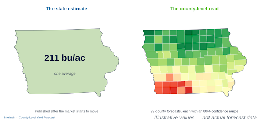
One state average hides the spread that matters. The county-level read reveals where yield is strong, where it’s slipping, and where your origination strategy should differ—all before the market has fully moved.
Why the Last Rounds of the Season Carry the Most Weight
Corn and soybeans don’t take weather risk evenly across the season. Grain fill for corn and pod set and pod fill for soybeans both land late, well after most of the crop is already in the ground and looking fine from the road. A forecast that hasn’t been refreshed since midsummer can miss exactly the risk a team needs to see heading into harvest.
That’s the case for a twice-monthly cadence rather than a single midseason call. Each new round lets a team watch the county map firm up in real time. Directionally, this season continues to track as one of the stronger corn and soybean years of the past decade across much of the Corn Belt, which makes the exceptions, where a pocket of the footprint is moving against that trend, worth watching that much more closely. Backtested against 2018–2024 final yields, this August method missed by an average of 2.7% on corn and 3.9% on soybeans across the 13 Corn Belt states, compared with 4.0% and 5.6% for USDA’s August forecasts.
Checking the Model’s Work: Reading USDA’s Own Survey Alongside Our Forecast
Alongside every round, we compare our county-level read against USDA’s weekly crop condition survey, the good/excellent ratings released through the season, as an independent check on the direction our model is moving.
What matters is whether that move is unusual: how it compares with the same stretch of weeks in each of the past ten seasons, for that state and that crop. A pullback that falls within the normal historical range gets treated differently than one that falls outside it. That distinction is what turns a raw number into something a team can act on.
When the Model and the Survey Point in Different Directions
Often, our forecast and the public survey move together. Occasionally, in a given state, they don’t. Our read and the condition ratings pull in different directions over the same weeks. That’s exactly the kind of localized signal a single state-level number would hide, and it’s a case where we tell a team where to look.
A handful of states carried that kind of watch flag this season. A condition rating is a survey, and a satellite-and-weather forecast is a model, and neither is a harvested bushel. The takeaway is that the disagreement itself is useful information: it tells a team exactly where local, on-the-ground conditions are worth checking before the next round.
What This Means for Your Team Heading Into Harvest
As the season closes, the forecast is county by county, not state by state. The value isn’t only in where the read lands in the final round. It’s in the story the rounds tell along the way: which parts of the footprint have been stable all season, and which ones moved, when, and why.
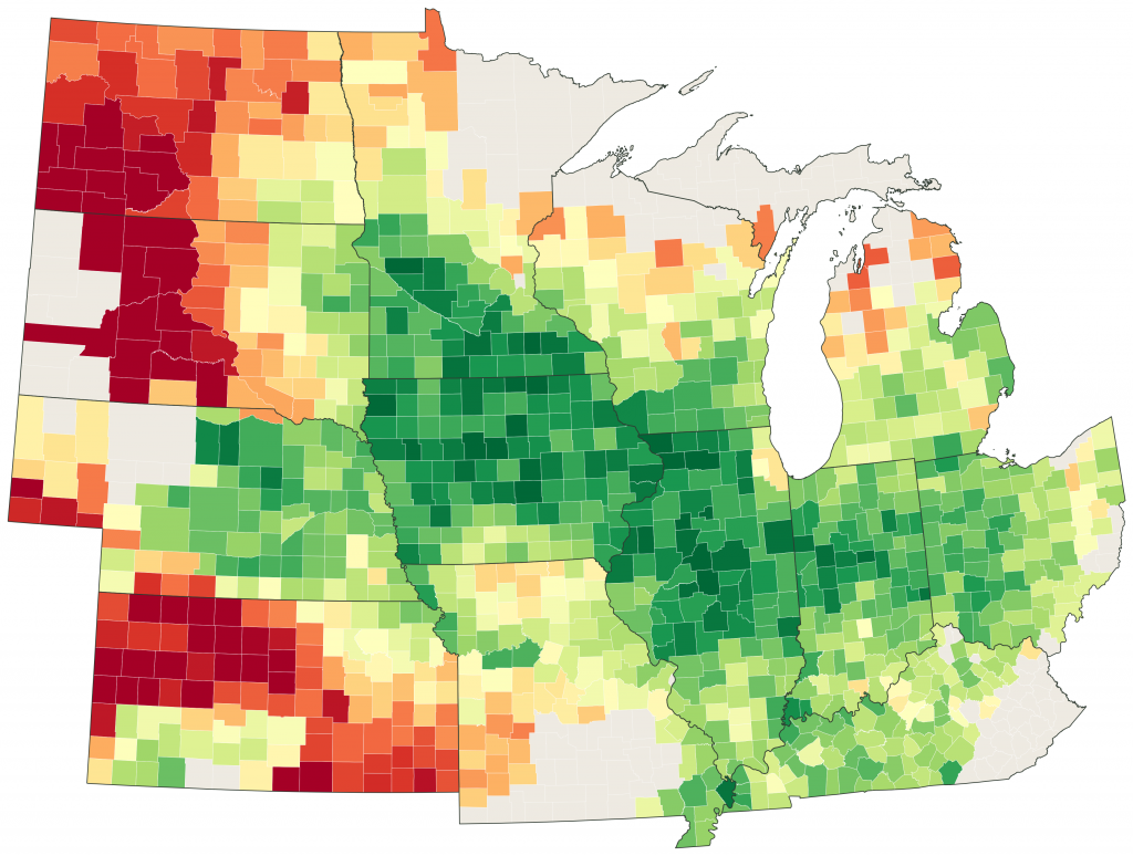
The County-Level Yield Forecast as of August 31 — every county in the 13-state Corn Belt, in one read. The core Belt holds deep green while the western fringe tells a different story. For illustrative purposes only.
That’s the difference between learning about a rough patch from the final harvest numbers and seeing it develop two or four weeks ahead, with enough lead time to do something about it.