

Publish Date: August 26, 2026
Author: Ram Rapaka
Key Takeaways
- Intelinair’s County-Level Yield Forecast provides in-season corn and soybean yield estimates for every county in your trade area, not a single state number.
- The forecast is built from satellite canopy imagery, weather, root-zone soil moisture, and more than 20 years of USDA county yield history.
- Every county number carries a calibrated 80% confidence range, so teams can size real downside risk instead of working from a point estimate.
- Forecasts are refreshed twice monthly through harvest, and each new round firms as the season’s weather and satellite signals evolve.
- The model is walk-forward validated, tested out-of-sample, year over year, and cross-checked against USDA’s own in-season forecasts.
Every grain origination desk runs into the same gap sooner or later: the decisions happen county by county, but the yield information arrives state by state.
Basis, space, buying, logistics – none of it is managed at the state level. A single state yield number, published after the market has started to move, leaves teams filling in the county-level picture from experience and instinct. That works until the year it doesn’t like the year the dryland edge of the footprint breaks hard from the well-watered core, and the state average tells you nothing about either.
That is the gap Intelinair’s County-Level Yield Forecast was built to close.
What is the County-Level Yield Forecast?
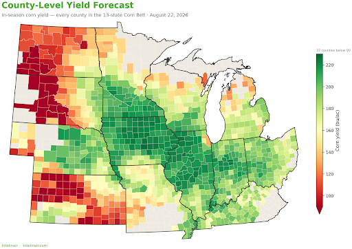
The County-Level Yield Forecast is an in-season, county-resolution corn and soybean yield forecast covering your entire trade area. Intelinair produces a yield estimate for every county in the footprint that carries meaningful corn or soybean acreage – hundreds of counties in a typical trade area – with the remaining Corn Belt states reported at the state level for full regional context.
The forecast is built from satellite canopy imagery (NDVI), weather and root-zone soil moisture data, and more than 20 years of USDA NASS county yield history. A machine-learning model fuses those signals into a county-by-county read that updates twice monthly through the growing season, so teams watch the forecast settle toward harvest.
What does each forecast round include?
Each round of the Intelinair County-Level Yield Forecast delivers a complete picture of the crop across the footprint:
- County yield maps for corn and soybeans, in bushels per acre, with your grain-handling locations pinned
- Trade-area acre-weighted yields with ten years of harvest history for context, the single number that best summarizes the crop a team will originate
- Planted-acre crop mix: corn versus soybeans, county by county, anchored to the USDA NASS state acreage as currently published
- Key risks into harvest: drought progression, disease pressure, and crop-stage timing, mapped to the specific parts of the trade area where they sit
- The signals behind the forecast: canopy vigor, soil moisture, and drought indices, so the read is never a black box
- Full county and state appendices with every forecast, confidence range, and planted-acre figure
Why does county-level resolution matter for grain origination?
Because a state average hides exactly the variation an origination team needs to see. In a typical season, counties inside a single trade area can range from crop failure territory to record-setting yields, a spread a state number compresses into one figure.
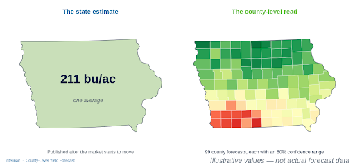
County resolution shows where the bushels are, and where they aren’t, before the public estimates arrive. That reading informs basis decisions, capacity planning, and buying across the territory.
How does Intelinair handle forecast uncertainty?
Every county and state number carries a calibrated 80% confidence range. The expectation is that the final harvested yield lands inside that range about eight times in ten, and in out-of-sample testing, the ranges have covered actual outcomes at or above that target.
This is confidence, not false precision. Wider ranges flag genuinely greater uncertainty, typically the dryland edges of a footprint, while tighter ranges mark the well-watered core. The P10, the low end of the range, serves as the practical guardrail: it tells how much downside a county realistically carries if the season finishes hot and dry.
How does the forecast change through the season?
The forecast updates twice monthly through harvest, and each round leans on different signals as the season matures. Early rounds are driven by planting conditions, soil moisture, and weather; as the crop develops, satellite canopy signals carry more weight and the forecast settles toward the final number.
That progression matters because the crop’s yield-setting windows, for example, grain fill for corn, pod set and pod fill for soybeans, arrive late in the season, when weather can still meaningfully move the final number. Twice-monthly updates let teams track how each new round of weather and satellite data shifts the county map, rather than anchoring to a single mid-season estimate.
How is the model validated?
The Intelinair county model is walk-forward validated: it’s tested out-of-sample, year over year, against yields it has never seen. Forecasts are also cross-checked against USDA’s own in-season state forecasts and more than two decades of county yield history, giving your team an independent check on how the model’s read compares with public signals throughout the season.
Who is the County-Level Yield Forecast for?
The forecast is built for organizations whose decisions run at county resolution: grain origination teams, agricultural retailers and cooperatives, and grain marketing organizations managing basis, space, and logistics across a multi-county footprint. Intelinair scopes each forecast to your specific trade area, so the deliverable maps directly to the geography the team actually manages.
Frequently asked questions
What crops does the Intelinair County-Level Yield Forecast cover?
Corn and soybeans, forecast at the county level across your trade area, with the remaining Corn Belt states reported at the state level.
How often is the forecast updated?
Twice monthly through harvest. Each round incorporates the latest satellite canopy imagery, weather, and soil-moisture data, and the read firms as the season develops.
What data goes into the forecast?
Satellite canopy composites (NDVI), weather and root-zone soil moisture, and more than 20 years of USDA NASS county yield history, fused by a machine-learning county model.
What is the confidence range on each forecast?
A calibrated 80% confidence range on every county and state number. The final harvested yield is expected to land inside the range about eight times in ten, and the P10 (low) end serves as the practical downside guardrail.
How accurate is the forecast?
The model is walk-forward validated, tested out-of-sample, year over year, and its confidence ranges have covered actual outcomes at or above the 80% target in true out-of-sample seasons.
How do I get a County-Level Yield Forecast for my area?
Contact your Intelinair sales representative to scope a forecast for your footprint, or reach out through intelinair.com.
See the yield county by county
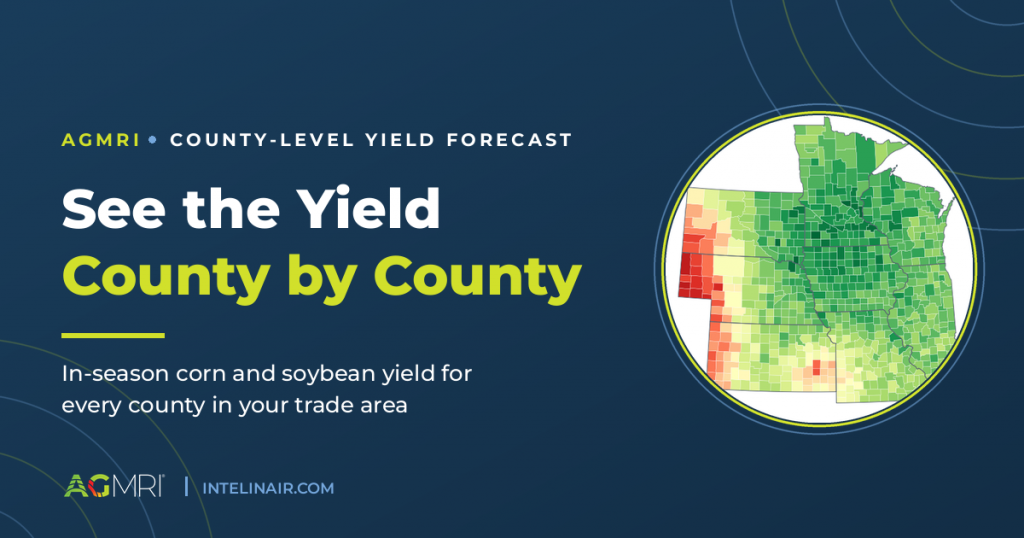
The County-Level Yield Forecast delivers an in-season corn and soybean read for every county in your trade area, updated twice monthly through harvest, with a calibrated confidence range on every number.
To learn more or scope a forecast for your area, visit intelinair.com or contact sales@intelinair.com.
Ram Rapaka is Vice President of Operations for Intelinair.